
Stair 2 - Exhibition Space to Studio:
 Since less people would be coming here, I decided to have the staircase design here less sophisticated and more simple but elegant.
 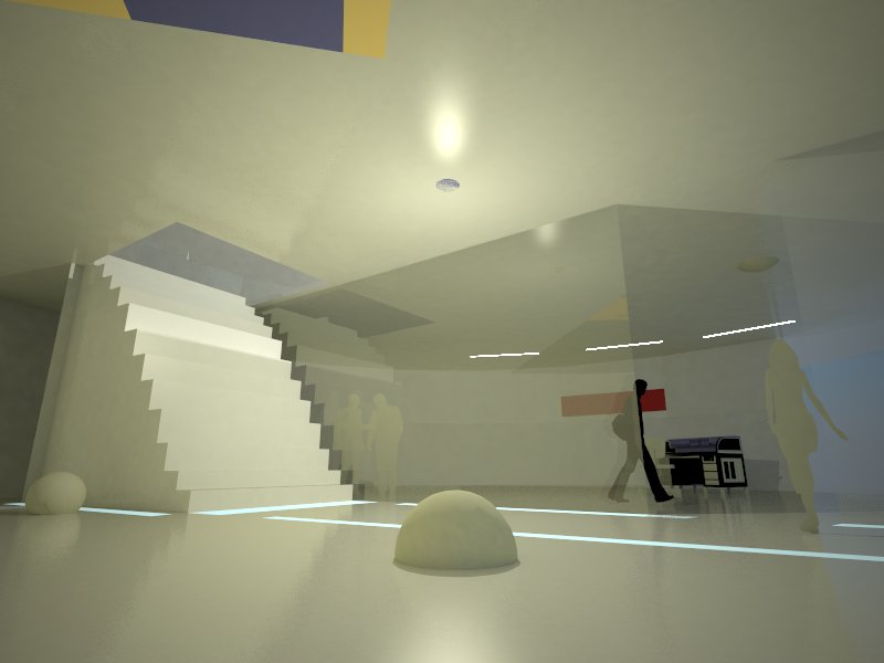 A simple glass frame would lead the person down some steps toward the main studio on the left, through glass walls. Strip lighting would help guide the person and illuminate/decorate the interior.
Stair 1 - Above Ground to Exhibition Space:
 With the stairs I designed, I decided that it had to be attractive and aesthetic so as to enhance the appeal of the artists work in the area. I used alot of low lighting on the stairs, as well as a glass railing.
 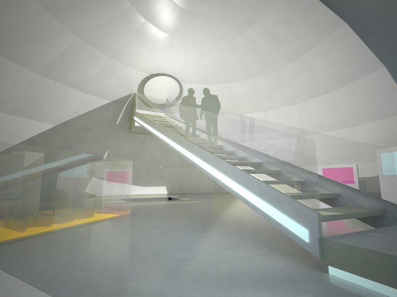 As you can see the staircase is intended to be quite long so that as the person descends he/she can get a feel of the whole space already as they walk through it. In the background you can see the staircase leading to the studio.
 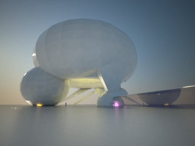 Above ground. Entry into the exhibition space is from the left dome with orange lights, however I intended that one would have to walk through the glass walkway into the smaller right dome and then walk out into the left dome. The idea of course is to make the person walk and get a feel of the domes as they walk toward it.
The SketchUp model:
For this week's task I designed three spaces, above ground area, an exhibition space, and a studio. I also designed two seperate staircases, one from above ground into an exhibition gallery, and a smaller staircase from the exhibition gallery into a studio.
For rendering in SketchUp I used VRAY.
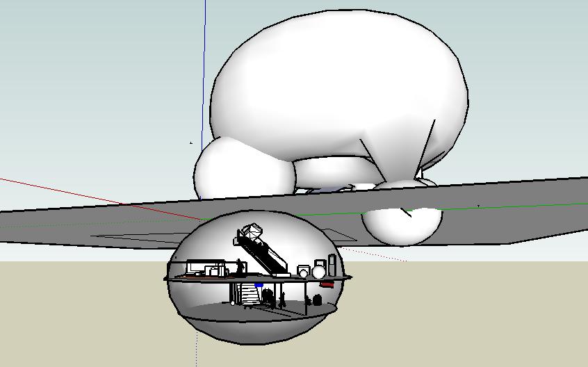 As you can see from this sketchup model the three levels shown here are from the very top the above ground space, the exhibition space, and the studio.
 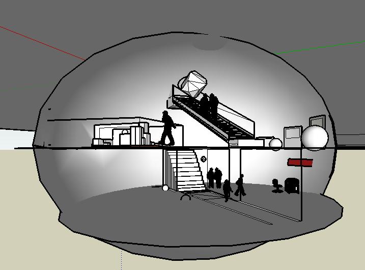 A closeup of the exhibition space and the studio.
The original section:
 The idea behind the drawing is the paw of an animal, while its footprints go underground in the section. The words were 'animal' and walk'.

1 comment:
Hi,
I really like the idea of having a long staircase, which helps get a good feel of the gallery as you've mentioned.
I also like the fact that it's straight and wide, which should make it easier on the artist to carry his/her artwork from either level into the gallery, and at the same time, the lights on the side of stairs, make them standout, giving the artist a noticeable entrance.
Well done! =)
Post a Comment